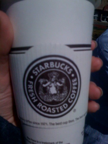
I believe that's the original version of their logo. When there was an outcry of this when they initially issued this on their cups, the company "covered" up the not-so-appropriate parts of the mermaid. I am not sure why they have gone retro. I am not keen about their new cups either. Blech!
Half the fun is saying... hey look at me. I like the white & green! Brown is like yuck. I did read about the outcry that the public had over their original logo from the 70's where the girls breasts were showing. They grew her hair longer... lol Only in the U.S.
This is just one of the many reasons I am a Dunkin Donuts coffee drinker...that's right guys I'm not afraid to say "A large regular please"....sorry 'bout your cup issues though....hey we get really stupid commercials so I guess we're even!
I totally agree--I loathe the "new" brown cups. But it is their original logo, I think they're doing this whole retro thing to garner excitement for that Pike Street roast, or whatever it's called.
Interesting how everybody feels so strongly about the green logo... (I completely agree with Shyla's comment btw... if you're going to change it, make it look better, not worse!)


14 comments:
DUDE! I said the same thing.... where is the traditional green?!
I was so confused. They said it wasnt permanent.
If you are gonna change your branding, at least make it COOLER ;)
Wooow! what's up with that?! Shyla did you miss the lady? Ya the Green is gone, but what the *****!
I wouldn't have seen this one, I'm a Mary Lou's Coffee Guy. Hey I look good carrying a pink cup ;)
I believe that's the original version of their logo. When there was an outcry of this when they initially issued this on their cups, the company "covered" up the not-so-appropriate parts of the mermaid. I am not sure why they have gone retro. I am not keen about their new cups either. Blech!
Half the fun is saying... hey look at me. I like the white & green! Brown is like yuck. I did read about the outcry that the public had over their original logo from the 70's where the girls breasts were showing. They grew her hair longer... lol Only in the U.S.
I think I'm soooo much more disturbed by the spread eagle-ness of it all! i just can't look away! :P
lol
This is just one of the many reasons I am a Dunkin Donuts coffee drinker...that's right guys I'm not afraid to say "A large regular please"....sorry 'bout your cup issues though....hey we get really stupid commercials so I guess we're even!
lol Rachel Ray is the queen of DD commercials!
Go back in time sometimes we must...how far we have come, the future will only show!
Now read that again with Yoda's voice in your head! lol
I still love the Bucks! No substitute!
lol that was awesome!
Totally agree!!! Its a bit to riskeeee for starbucks! :)
I totally agree--I loathe the "new" brown cups. But it is their original logo, I think they're doing this whole retro thing to garner excitement for that Pike Street roast, or whatever it's called.
Interesting how everybody feels so strongly about the green logo... (I completely agree with Shyla's comment btw... if you're going to change it, make it look better, not worse!)
hate the cups but LOVE the word 'inappropriate'
Oh...I have to agree. And they look cheap and 80's inspired.
Post a Comment